THE SPICY COPY BLOG
What to Include on Your Contact Page (And Why It’s Freaking Important)
What to Include on Your Contact Page (And Why It’s Freaking Important)
There’s one page everyone seems to forget about and that page… is the Contact page.
Hell. Some websites don’t have them at all—which I get because it’s not the most exciting page.
But the truth is, if you want people to inquire about your services, then you must have a contact page and that contact page must be more than just a submission form.
So, if you’re wondering what the hell else to put on your Contact page besides your submission form (or why it even matters), this one’s for you, girl.
Your contact page is a super important page
Here’s why:
1 – It’s the last opportunity to connect with someone before they potentially reach out
If someone has ended up on your Contact page, they’re either ready to reach out—and may have gone straight to your Contact page—or they’re heavily considering inquiring.
(Or, they’re a website copywriter stalking your Contact page to see if it’s optimized. ; )
That’s totally different from the other pages on your website that someone might be checking out just because they’re curious.
In other words, while your About/Service/Home page could be for any half-curious website stalker, your Contact page is for HOT leads.
And you don’t want their excitement and ready-to-take-action attitude to fizzle out when they end up on that page and only see a form that asks for an email, name, and message. (We’ll talk about what should go ON your submission form later, too).
Which means…
2 – Your Contact page can be a make-it or break-it situation
You want a potential client to open that page and actually inquire so you’re gonna want copy that highlights what’s awesome about working with you, is full of personality, and addresses any lasting hesitations they might have.
Just like all the other pages on your website.
If someone who’s already thinking about reaching out lands on your Contact page and loves what they read—they’re DEFINITELY gonna inquire.
But if there’s no copy on that page (or god forbid, there’s no Contact page at all), they’ll either end up waiting or they might forget to reach out altogether.
Humans are fundamentally lazy (fun fact: it’s how our brain preserves calories for survival)! So, if something feels too difficult, we tend to skip it altogether.
You don’t want to lose a lead just because they couldn’t easily contact you, so make sure that you’re making it as easy as possible for someone to inquire.
3 – For SEO reasons, you need to have 300 words minimum, anyway
Not all website pages are equally important, especially when it comes to ranking on Google. Your Contact page is an important page to optimize. And that’s because…
If someone is looking for your service/industry on Google and your Contact page pops up and makes them feel like they’ve found their answer, that person might inquire… just from your Contact page alone.
And unlike the other pages of your website, they don’t have to click anything except the submit button.
So, you want to make sure that page is set up just right to turn visitors into inquiries.
What to put on your Contact page
1 – A keyword-rich headline
You need a little copy before you jump into your submission form so go ahead and give this page a headline. And, try your hardest to fit in a keyword.
A few formulas:
You deserve [Service] That [Ways Your Service Benefits Your Client]…
Ready for [Service] That [Ways Your Service Benefits Your Client]?
If you can’t squeeze in a keyword, that’s okay—what matters most is that people love your website copy so much that they keep reading because the more time people spend on your website, the more Google likes you, too.
(Mine doesn’t really have a keyword, but it is one of my favorite headlines on my whole website… worth it.)

If you want more than a headline, you can always have a headline and then a conclusion underneath that states the main amazing things someone will get from being your client.
Remember: You want to get them EXCITED about inquiring so don’t just say “Inquire about Showit Website Design,” get spicier.
2 – Submission form
Of course, you’ll include your submission form on your Contact page, but make sure it’s not just a form that asks for an email address, a first and last name, and info about the project.
Why? Because this is the form that qualifies people to work with you!
And, it’s the form that gives you, the business owner, enough info to know if you’re interested in taking the next step with this lead.
(Not everyone will be the right for you—you have the right to say no to anyone who doesn’t feel like a good fit or that you aren’t excited about working with!)
So don’t forget to include the important questions you NEED the answers to before you go any further with this lead.
If you want people to download your pricing guide before they submit an inquiry—put a question about that on your submission form.
For example: “Have you reviewed my pricing guide?” And then they can check yes or no.
Or maybe you only accept people who make over a certain amount every year… ask that question on your submission form.
For example: “This program is for those who make over $50,000 a year. Is that accurate for your yearly income?”
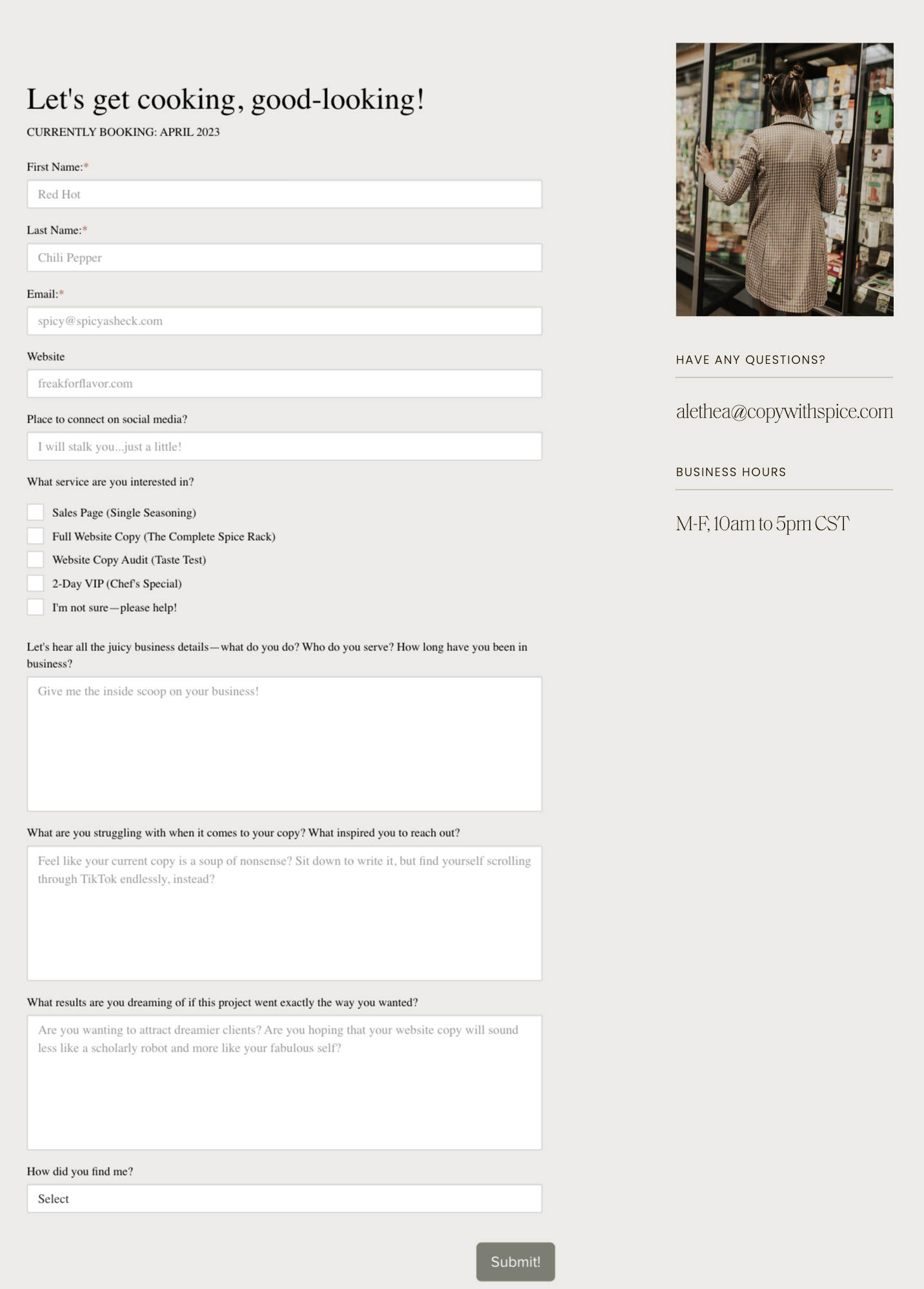
Here’s what mine looks like!

(Psst. In case you were curious—this form is actually an embedded Dubsado form—you can learn how to embed a Dubsado form on your Contact page here. And if you want 20% off your first month/year with Dubsado, use my code: copywithspice.)
The goal of your Contact page—and website copy, in general—is to qualify your leads for you so you don’t have to waste time meeting with people who aren’t interested in what you offer or how much you charge. So go ahead and spell out specifically what you’re looking for.
(I promise you, you’re doing a favor to them, too! Because if they get on a call with you and realize you’re way out of their budget, they’ll feel like they’ve wasted their time, too!)
3 – A Mini About
If you take a guess at what a mini about is, chances are you’re spot-on—it’s a small section that’s all about you and it often appears on Home pages, Blog/Portfolio/Resource pages, and… you guessed it, Contact pages.

(See examples here, here, and here.)
A mini about is not only a great way to bump up your word count on your Contact page, but it’s a great thing to have in case someone reads only your Contact page—that way, they still get a taste of who you are.
Pro tip: Don’t just talk about your background, make sure you share how your experience BENEFITS your client.
For example: “With over 10 years of design experience, I’m here to blend brand strategy with your chic style to create a website your visitors never want to leave.” That way you’ve highlighted your qualifications, but tied them to why your reader should care.
4 – FAQs section
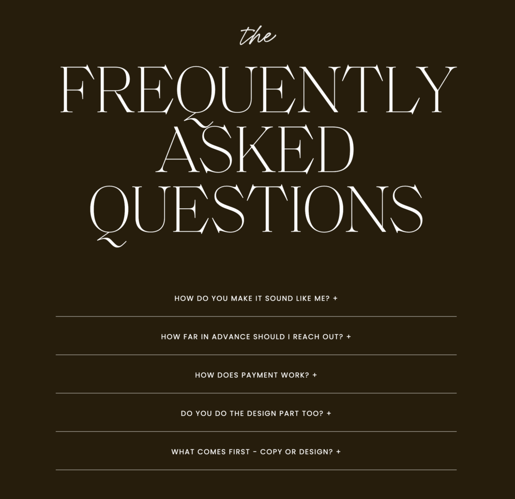
While this isn’t required on your Contact page, it’s a great way to boost your word count! And often, it just makes sense to have them on this page. Because… there will likely be specific questions you didn’t address in your website copy, but that someone still might be wondering about.
You can also include questions that YOU want to answer.

As you can see from my FAQs section, I have a question about whether design or copy comes first and while that doesn’t directly relate to my services, it’s something I get asked a lot about and want people to know before working with me.
(Spoiler: if you’re investing in custom design, website copy usually comes first!)
Pro tip: Don’t hide the important information in your FAQs. It’s 100% possible someone won’t read your FAQs. If there’s stuff they NEED to know before inquiring, make sure you’re putting that information throughout your website copy and not tucked away in a section on your Contact page.
Pro tip #2: Don’t have a million questions. A good rule of thumb is to aim for 3-5 FAQs (unless it’s a sales page).
5 – “Why choose me?” section
The Contact page is (most likely) the last stop someone makes on their journey as a reader before becoming a client so don’t be afraid to tell someone all the reasons they should choose you. And unlike, let’s say, your Blog page, where it would be super weird to have a “you should hire me because” section… On your Contact page, it totally makes sense.
Behold, my shameless bragging…

Tell them the reasons you’re unique and/or what they can expect from working with you. Have fun with it and don’t be afraid to humbly or, if that’s not your style, to audaciously brag.
You’re the bomb.com and they’re already interested (that’s why they’re on your Contact page), so don’t feel weird about coming right out and saying what’s so great about you.
6 – Send them to other places
If they’ve scrolled all the way to the bottom of your Contact page, it may be because they’re interested, but they’re not quite ready to take the plunge… Which is okay because you only want people who are “how-soon-can-we-start” excited about your services.
If you want to give the not-ready-yet types of online visitors a few ways to connect with you, go ahead!
You can tell them to connect with you on Instagram, share the sign-up form for your newsletter, or showcase a few of your favorite blog posts.
At the end of my Contact page, I give these three options.

(If you’ve read Building a StoryBrand—which I highly recommend—Donald Miller calls these the “let’s date” calls to action (CTA). The other type of call to action—like let’s work together—is a “let’s get married” call to action. A fun little way to think about the different types of commitment you’re asking for in a CTA! )
Bottom line: Your Contact Page Should…
- Exist, if you don’t have one already—unless you don’t want people to contact you
- Be more than 300 words to keep Google happy
- At MINIMUM include a headline and a submission form that asks important, prequalifying questions
- And, if you need more words, which is highly likely, you can always include a mini about, FAQs, a “why choose me” section, and links to other free resources to continue building your relationship with your lovely website visitors
Now that you’ve got all that info… don’t you dare let me see you sleeping on your Contact page—you and those dreamy clients who are coming to your Contact page all worked and ready to go deserve better!
And if the idea of trying to rework any of your website copy makes you queasy…
Or if you’re thinking that you should rework it, but are actually gonna end up putting it off for at least another year…
I’ll happily write your Contact page for you AND every other page on your website. All you have to do is head to my Contact page (which is more than just a submission form, I promise).